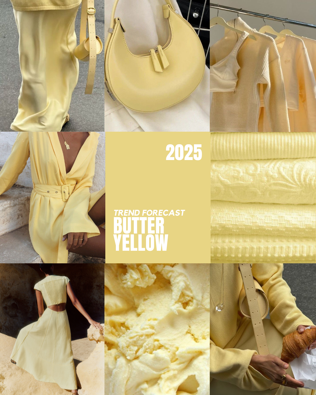
BUTTER YELLOW FOR SPRING
|| I’VE BEEN WATCHING IT UNFOLD HERE IN Australia, the soft, muted butter yellow quietly working its way into summer collections, filling retailers with an understated glow. It’s not loud, not neon, not trying too hard. Instead, this pale, creamy yellow is slipping seamlessly into workwear silhouettes, modern matching sets, and soft tailoring, creating a look that’s polished yet undeniably fresh.
And if there’s one thing I know, it’s that what takes off in the Southern Hemisphere’s spring often makes its way into the States just in time for their warm-weather season. So, if your brand is curating a lineup for the upcoming 2025 spring drop, butter yellow deserves a place on your mood board.
WHY IT WORKS
This isn’t the yellow of past seasons. It’s not bright lemon or deep mustard. It’s airy, wearable, and pairs effortlessly with neutrals like off-white, taupe, and stone. Think of it as the quiet luxury of color trends. It feels refined in structured pieces like blazers and relaxed trousers, but it also translates beautifully into flowy linen dresses, knit tops, and minimalist accessories.
HOW TO STYLE IT IN YOUR COLLECTIONS
✔ Workwear Refresh – Tailored vests, relaxed blazers, and wide-leg trousers in butter yellow feel modern but still sophisticated. Perfect for brands leaning into elevated minimalism.
✔ Monochrome Matching Sets – Whether it’s a two-piece linen set or a structured co-ord, head-to-toe butter yellow makes a statement without overpowering.
✔ Texture Play – Try it in soft knits, washed cotton, or crisp poplin for dimension. The subtle tone allows fabric quality to shine.